Timeline: February 2020 to September 2020
My Role: UX/UI Designer
Goal: Launch SaveBetter, the first open banking platform in the US
About the company and the product
In 2019, a German fintech Deposit Solutions set up its US office in New York City to launch the very first open banking product in the United States – SaveBetter. SaveBetter offers multiple high-yield savings products from different financial institutions to US customers. Customers only need to open one account in order to get easy access to federal insured products form banks and credit unions all over the country. They also have 24/7 access to their funds through the online platform.
Context
I joined the Deposit Solutions (now Raisin) US team in February 2020 as the lead designer. Working together with a small team made of product owners, product mangers, and developers, we successfully launched SaveBetter in September 2020.
When I joined the team, there was a design system created by designers who previously worked on this project, as well as a few pages. However, the customer journey was not finalized.

Phase 1: Finalize Customer Journey
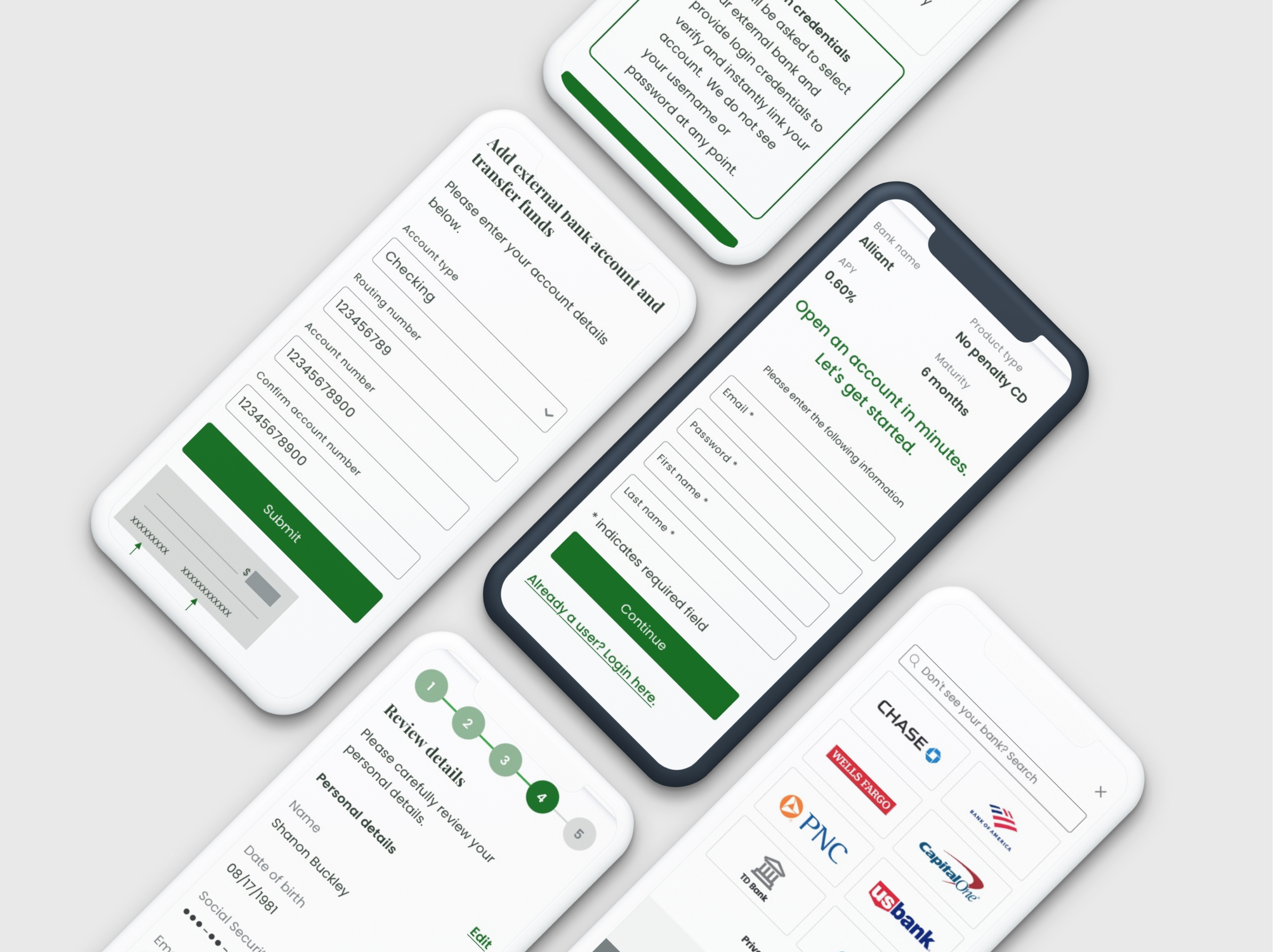
I teamed up with a product manager, held multiple meetings with stakeholders from business, legal, and marketing, to understand the requirements from different aspects. We also conducted competitor analysis to understand some of the pain points while opening an online bank account. Our goal is to create a simple and seamless experience for customers to sign up and make a deposit.
Based on preliminary researches and competitor study, one of the pain point was that some banks needed a few days to verify an external account. We provided two faster verification options so customers can complete registration in a few minutes.

Phase 2: Audit and Update Design System
While auditing the existing design system, I noticed that some of the color combination didn’t pass WCAG 2.0 level AA or AAA requirements. I went through all the components and updated some grey colors to increase the contrast ratio, made sure each component was using the correct color combination. Using EightShapes Contrast Grid, I was able to check all combinations at once.

I also redesigned some components. For instance, the stepper component:

There were a few issues with the old stepper component:
- Desktop design didn’t have the step name, which was not consistent with tablet and mobile designs.
- The first step indicator on desktop was located between step 1 and 2, which was not clear which step it’s actually on.
- Since we don’t allow customers to go back or use the back button, the arrows on the tablet and mobile designs were misleading.
- Long step names looked busy on small screens. Customers can read the page title below the stepper component on the page to find out the step name.
I ended up creating a simpler stepper component with the number of the step in a circle:
- Design on all screen types are consistent.
- Less text and larger font is more legible.
- Using three different colors to indicate the finished step, current step, and future step.
- Only showing the progress or the registration, no redundant content, less distraction.
I also updated some other components to improve their functionalities or to create a cleaner, more consistent user experince.
During the design system audit and update process, I also worked with the dev team because some of the components were already coded before I joined the team. We went through all the updates and made sure the code was updated as well.
Phase 3: Design UI, create prototype
At the stage, I had a finalized customer journey and an updated design system, as well as some screens designed by previous team. I was able to reuse some of them by updating certain components, and created the rest screens.

A screenshot of all the pages I created for the funnel, for three screen sizes.
I then created a click through prototype in InVision, link to desktop version here
Mobile prototype:
I walked through the prototype with the entire team, received feedbacks and went through a few round of revisions. At the same time, the dev team was working on coding the approved screens. After a screen was developed, I always run design reviews with the developer to check on the design, and functionality of the coded page.
Phase 4: Testing and market launch
After all the funnel pages and functionalities were in place, the entire team did massive testing and bug fixing. I also created the dashboard and the website, to prepare for the market launch.
We finally launched SaveBetter in September 2020.
After launch, I continued working with the product team to optimize the registration funnel based on customer feedbacks, funnel data analysis, and heatmap recordings. I also designed new features, such as joint account, referral bonus, and etc, to offer customers more opportunities to save.
Less than two years after launch, SaveBetter is offering savings products from 14 banks and credit unions and has over 38,000 active customers, and continues to grow rapidly as the interest rate in the US market is going up.